1. Introduction
Some time ago, I posted a tutorial on creating election maps with CartoDB. CartoDB is great, and allows you to quickly and easily create interactive maps and post them online, but it doesn’t allow you to do many of the things that more complex mapping software will allow you to do, and gives you relatively limited options for displaying and exporting your maps.
If you want to do things you can’t do in CartoDB, you need to use a GIS (geographic information system) application. The most widely used of these is probably ArcGIS, but it’s expensive and will only run under Windows. Most people I’ve talked to who make maps prefer to use QGIS, which is free and open-source software available for macOS, Windows, and Linux. However, QGIS can be confusing for beginners and the documentation is somewhat lacking. In this post, I will detail what I’ve learned in my attempts to make election maps with QGIS, in the hope that it will save other novices some time.
Our example project will be a county-level map of the results of the 2016 US presidential election in Florida. However, the methods we’re about to discuss can be used to map many things other than elections.
2. Installing QGIS
If you’re running Windows or macOS/OS X, you can download an installer from the downloads page on the QGIS website. That page also provides installation instructions for various Linux distributions. If you are running Linux, you should note that the software repositories for your distribution may contain old versions of QGIS or no versions at all. In this case, you should manually add the QGIS repositories for your distro.
Configuring QGIS
Just one thing: you may find that your mouse wheel zooms in and out way too quickly, and if, like me, you’re using an Apple Magic Mouse, it’s easy to do this unintentionally and mess everything up.
Solution: go to Settings > Options > Map Tools and turn the zoom factor all the way down.
3. Preparing your data
As in the previous tutorial, we need two types of data: vector data providing the shapes and locations of the counties, and a spreadsheet providing the election results. I’ve placed this data in a GitHub repo for convenience, but I’ll detail how to obtain it below.
Vector data
The US Census Bureau provides shapefiles for US county boundaries. We’ll be using the 2013 boundaries. They provide three different files with different resolution; even the lowest resolution would probably be enough for our purposes here, but I downloaded the medium-resolution file just to be safe.
There are no shapefiles for individual states that I can find, but I edited the file in QGIS to contain only Florida counties.
Election results
We will need to import the election results from a CSV file. CSV (comma-separated value) is the simplest possible spreadsheet format, consisting only of text fields delimited by commas. Any spreadsheet application (Microsoft Excel, LibreOffice, etc.) should be able to save a spreadsheet in this format.
Florida election results can be obtained from the Florida Department of State. They only provide an HTML table, as far as I can tell, but you can convert an HTML table to CSV.
I placed these election results into a CSV file I created using 2012 election data provided by the Guardian. I am not aware of any source that provides county-by-county US election data for the entire country in a usable format, so I am compiling the 2016 election results myself.
Specifying data types with a CSVT file
The repo also contains a CSVT file. This one requires some explanation. Unlike more complex formats for tabular data – XLS, ODS, and so on – CSV files don’t encode any information about data types. QGIS can’t tell whether the cells in the spreadsheet represent numbers, text, dates, or whatever else, and for some reason you cannot set this manually when importing it.
The CSVT file is a list of data types corresponding to each column, in quotes, comma-separated. The only three types we need to be concerned about right now are String, which is used for text, Real, which is for decimal numbers, and Integer. (There are other types, mostly used for dates and times.) Suppose you have a table of counties with the county name (a string), population (an integer), and area (a decimal):
| Name | Population | Area |
|---|---|---|
| Autauga | 55,347 | 604.45 |
| Baldwin | 203,709 | 2,027.0 |
| Barbour | 26,489 | 905.5 |
| … |
Your CSVT file will look like this:
"String","Integer","Real"
Put the CSVT file in the same directory as the CSV file, and QGIS will automatically read it.
QGIS isn’t very strict about types, and will let you do math with strings. However, this can sometimes cause unexpected things to happen, so it’s better to explicitly specify your data types.
One final note: if you add these files to your project in QGIS, edit the data, and save the changes, your changes will be reflected in the original file.
4. Importing your data
Importing vector data
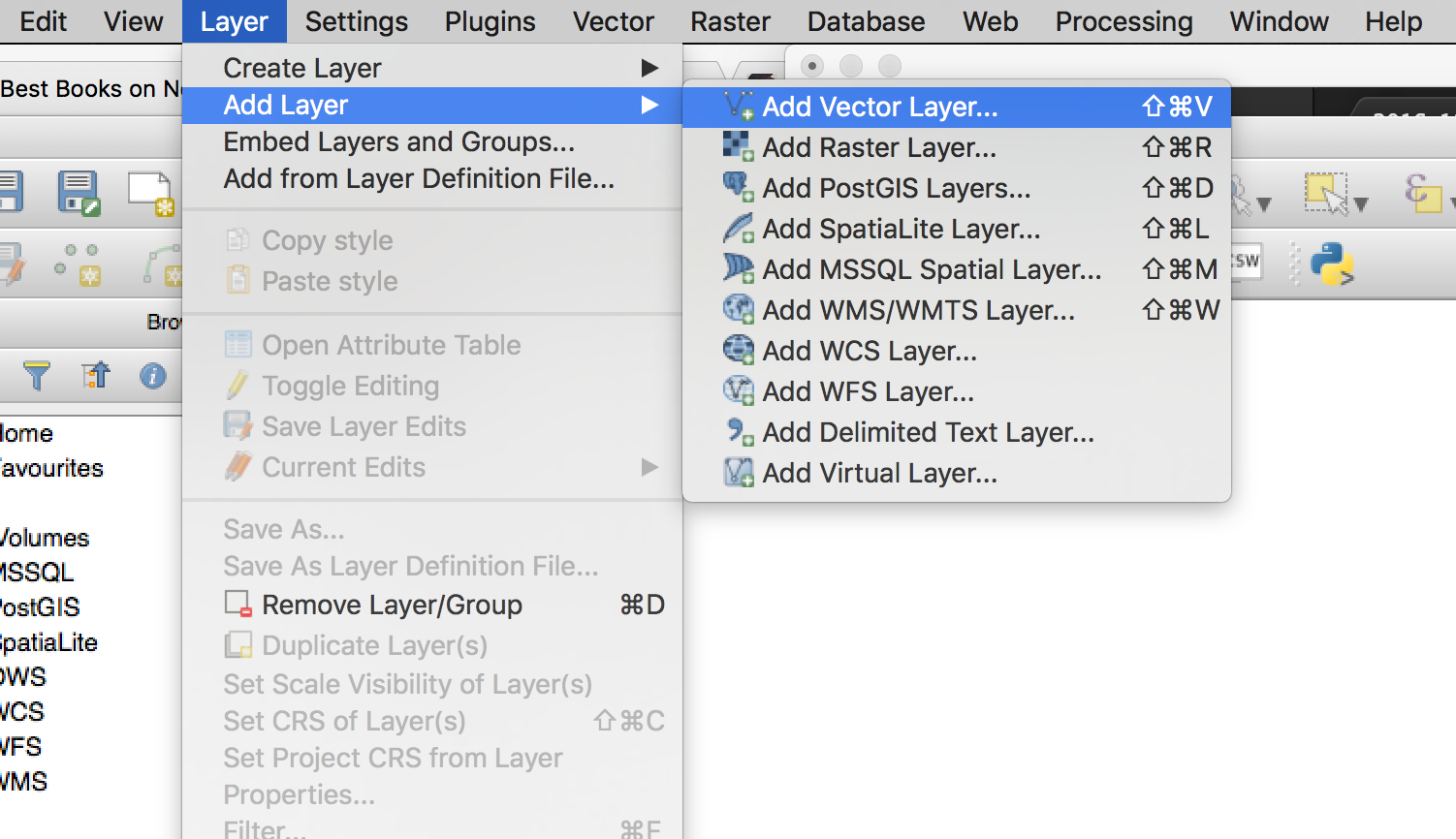
From the menu bar, select Layer > Add Layer > Add Vector Layer.
Navigate to the directory containing the shapefiles and select “cb_2014_us_county_5m.shp”. You will now see a map of Florida counties:
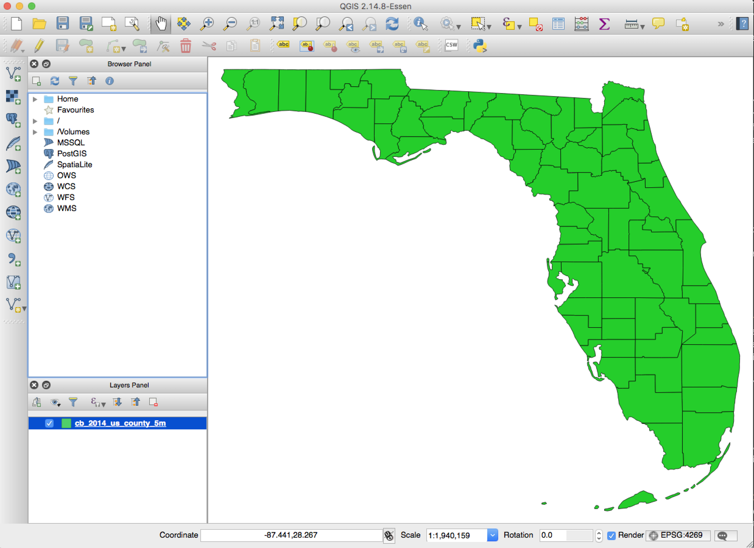
Note that this vector layer is now listed in the Layers Panel at the lower right. We could add additional layers to show terrain features, cities, and so forth.
A note on projections
[Feel free to skip this section if you’re in a hurry.]
Notice the button at the lower right that reads “EPSG:4269.” This is the CRS Status button. A coordinate reference system (CRS) defines a projection for the map, along with some related information that we need not be concerned about right now. Click on this button, check the box that says “Enable on-the-fly CRS Transformation,” and you can change the CRS:
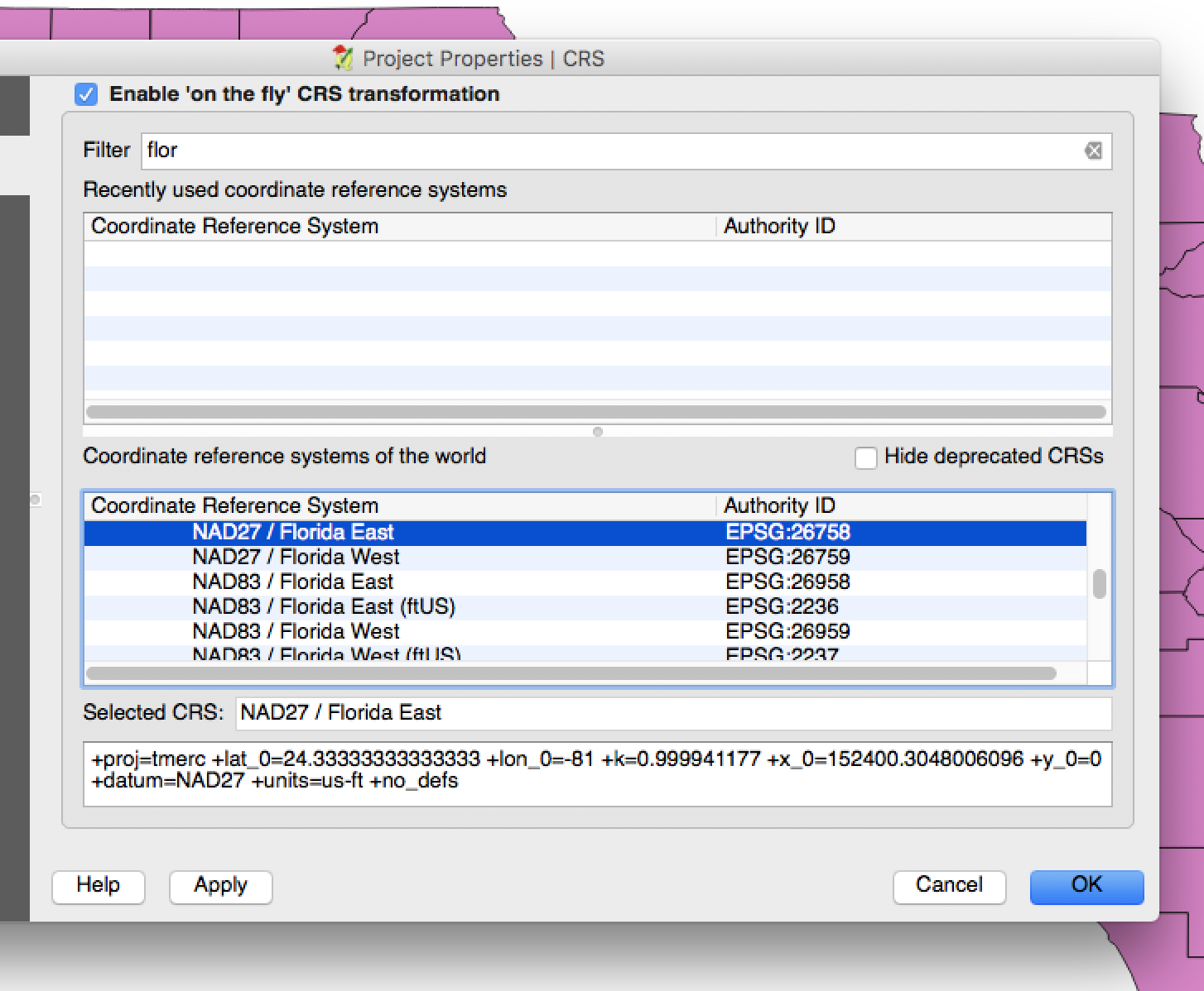
QGIS comes with a vast array of CRSes. If you search for the name of the place you’re trying to map, you’ll often find some that are intended for mapping that area. In this case it won’t make much difference, but if you’re mapping the entire continental US, you’ll want to use a CRS that will reduce distortion. A good choice is USA_Contiguous_Albers_Equal_Area_Conic, which is used by the US Geological Survey and the US Census Bureau. In this case I’ll use NAD83 / Florida GDL Albers.
Importing tabular data
To import the CSV file, select Layer > Add Layer > Add Delimited Text Layer. (You can actually add it using Add Vector Layer, but doing it this way gives us access to some useful options.)
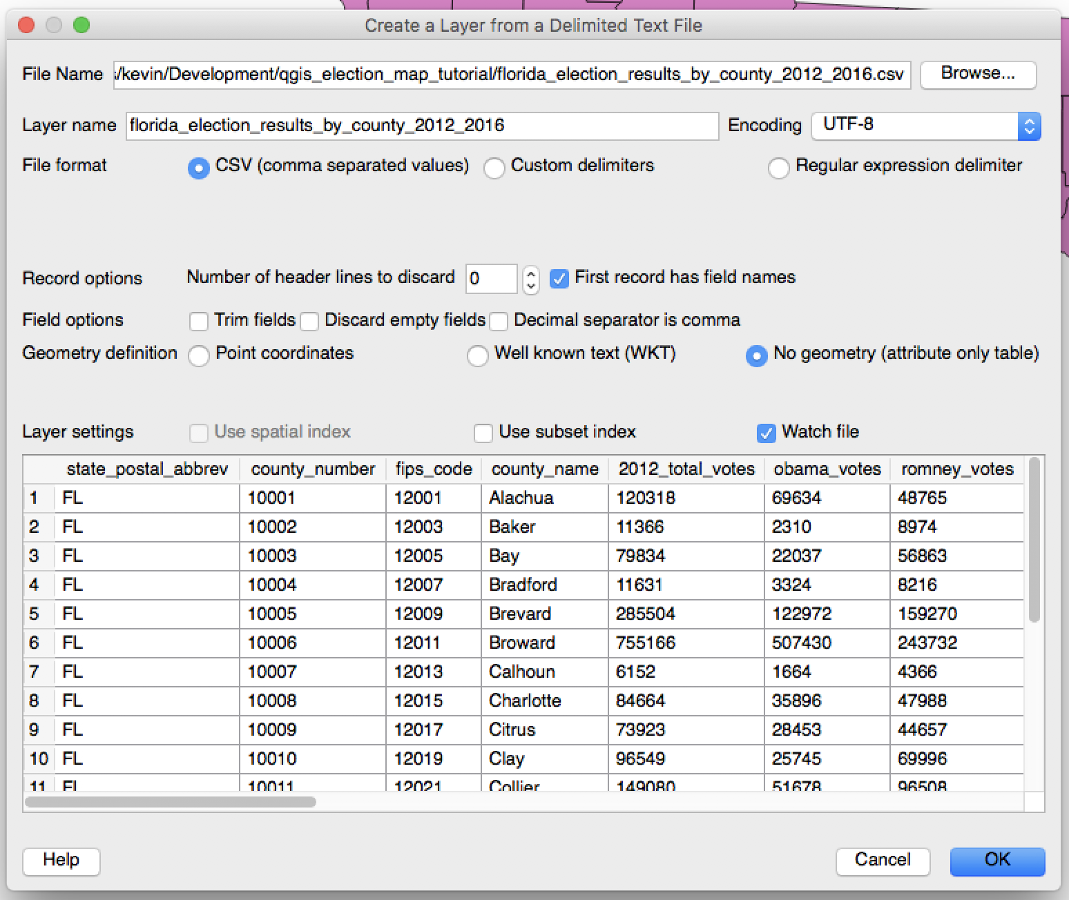
Select “CSV” and “No Geometry.” (If we were plotting points on a map, we could specify the latitude and longitude coordinates in columns of the CSV.) One other interesting option here is “Watch file.” If you check the box, the data on the map will be updated whenever you edit and save the original file. However, you must refresh the map (with the refresh button or F5) in order to see the changes.
5. Joining the vector data and election results
Along with the shapes themselves, the Florida county shapefile contains various metadata about the counties. To see it, right-click on the layer in the layers panel, then select “Show Attribute Table.”
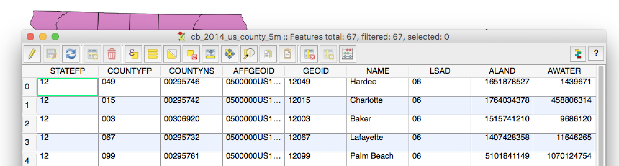
This table contains the name, land area, water area, and various ID codes for the geographic unit and its characteristics. For example, LSAD is the Legal/Statistical Area Description – in this case, always “06,” which signifies a county.
The column we’re interested in here is GEOID, which is the FIPS code for the county. This is a federally standardized code that uniquely identifies the county. It’s a combination of the STATEFP, 12, which identifies Florida, and the COUNTYFP, which identifies the county within Florida.
The election results table we’re using has a column for the FIPS code, so we can use these codes to join the tables. Double-click on the shapefile layer in the Layers Panel, or right-click and select Properties. Then select Join, and click the green plus sign to add a new join.
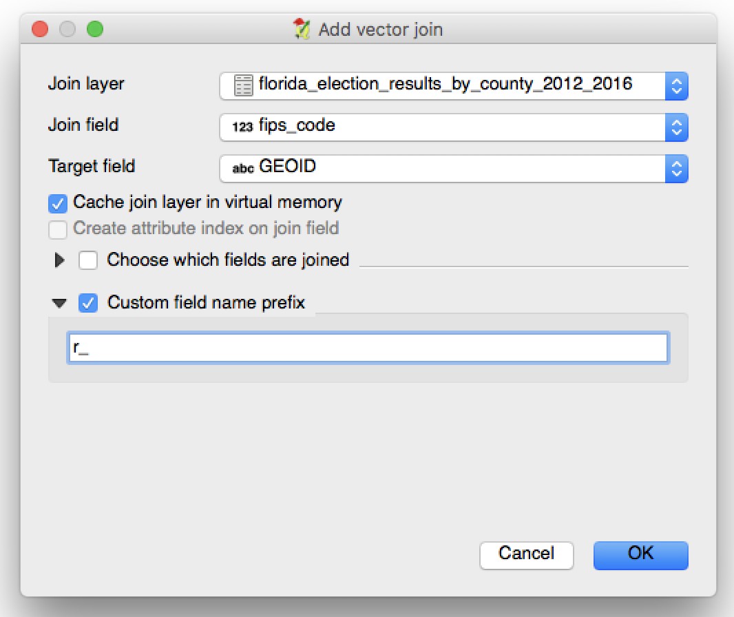
Select the corresponding columns. Programmers may notice that they’re different types, which QGIS does not care about (but see below). I recommend entering a short table prefix; otherwise the field names will be long and unwieldy. I’ll use “r_” as a prefix. Click OK and you’re good to go.
There’s a potential gotcha about FIPS codes, which is not relevant in this case, but I’ll mention it because it may trip you up if you try to map other states. FIPS codes are zero-padded so that all of them are the same length. For example, the first county in Alabama (FIPS code 01) is not 1001, but 01001. If the FIPS codes in your data table were stored as integers at some point, they might lack the leading zeroes, and QGIS won’t be able to match them to the shapefile.
From the Layers Menu, open the attribute table again. You should see that the counties are now associated with the election data.
6. Displaying the election results
Now we need to color in the county polygons to reflect the results of the election.
QGIS expressions and data-defined overrides
Open up the Properties dialog for the county vector layer again, then select Style from the menu at the left. This is where we can alter the color of the polygons, the thickness of the borders, the opacity of the entire layer, and so on. The dropdown menu at the top will show us some preset options for this:
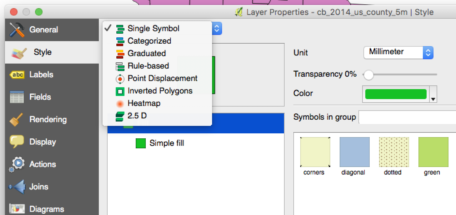
None of these will allow us to do exactly what we want to do. Fortunately, QGIS will allow us to do almost anything we want by using overrides. Click on “Simple fill.”
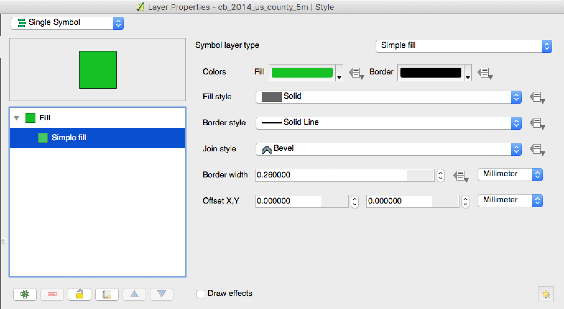
Most of these options are fairly straightfoward – we can set the color of the fill, the color of the border, the thickness of the border, and so forth. Notice, however, the icon to the right of many of these fields. This means we can use a data-driven override to set that field differently for each polygon, according to the data in our table.
If you mouse over the icon, or click on it and select “Description,” you’ll see a synopsis of what you can do with that particular field. Try this with “Border Style.”
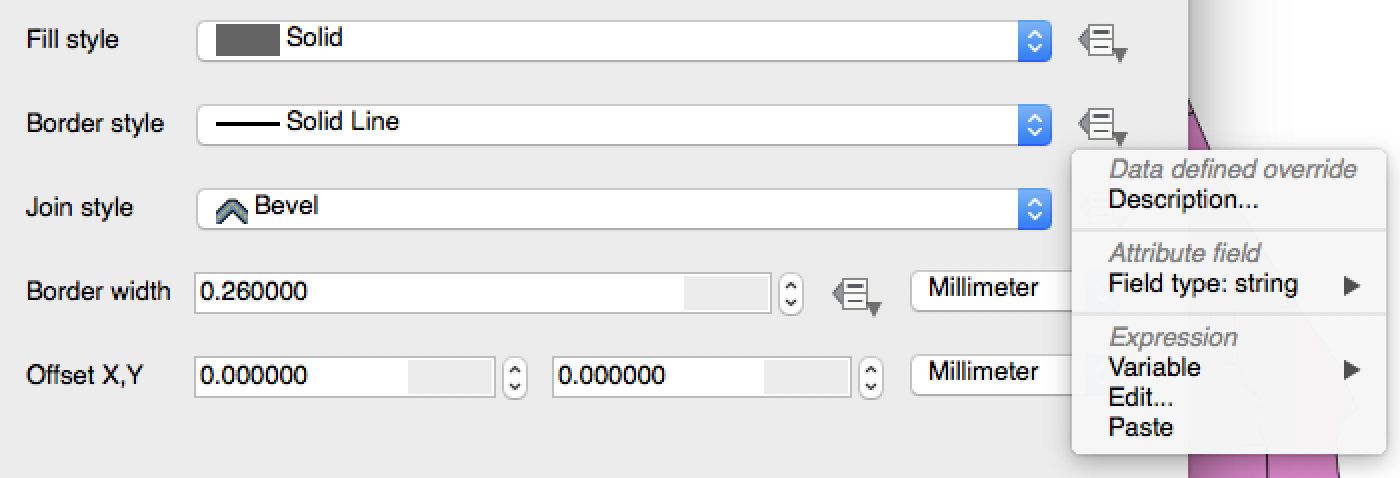
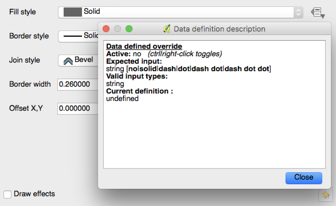
This tells us how we can dynamically style the border. Specifically, we can provide a string (i.e., text). This string must be one of those on the list: no, solid, dash, and so forth. Depending on which string we provide, either there will be no line at all, or it will be rendered as a solid line, dashed line, etc.
So how do we give QGIS this string? Click on the icon again, then select “Edit…” under “Expression.” This will take us to the expression editor.
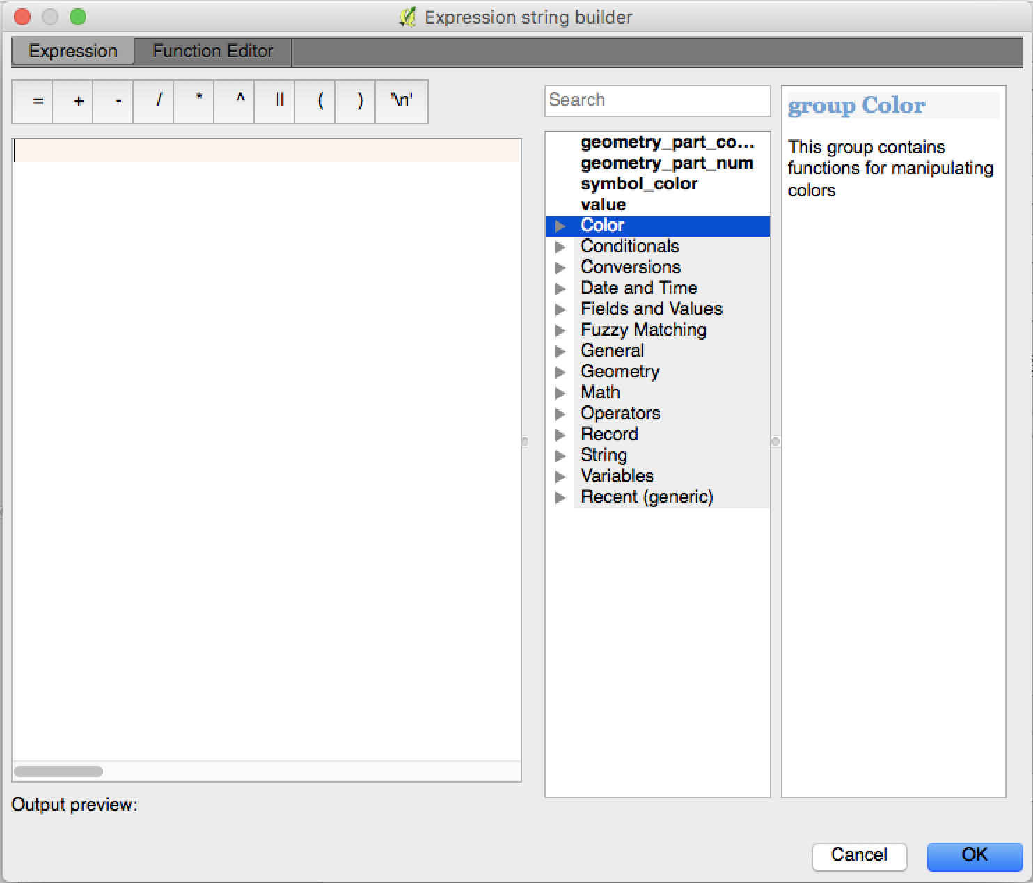
QGIS implements a simple programming language you can use to style your maps (and do many other things). The dropdown menus at the right will show you the built-in functions and variables you can use.
The expressions we’ll use today will be conditionals. In QGIS, these take the following form:
CASE
  WHEN some_condition
    THEN some_result
  WHEN other_condition
    THEN other_result
  ELSE third_result
END
This is easier to understand with a concrete example. Try this:
CASE
  WHEN "NAME" = 'Broward'
    THEN 'no'
  WHEN "NAME" = 'Miami-Dade'
    THEN 'dash'
  ELSE 'solid'
END
Now exit the expression builder and click “Apply.” If you look at the southeast corner of the map, you’ll see that Broward County has no border, Miami-Dade has a dashed border, and every other county has a solid border.
At least three things about the expression above are not obvious and require further explanation.
First: QGIS doesn’t care about line breaks and indentation. That’s just a convention to make the expression easier for humans to read.
Second: QGIS will evaluate each condition for each county until one of them evaluates to true, and then stop. If a county matches more than one condition, only the first one matters. If it doesn’t match any condition, then it defaults to the ELSE result.
Third: single and double quotes are not the same. Text in “double quotes” represents the value of a column in the table. Text in ‘single quotes’ is a string literal; it represents actual text. If we typed WHEN 'NAME' = 'Broward', QGIS would check whether “NAME” and “Broward” are the same word – which they’re not, so the condition would never be met. Likewise, if we typed "Broward", QGIS would look for a column called “Broward”. If something isn’t working right, double-check the quotation marks.
QGIS functions
Now click on the yellow icon to the right of “Border Style” and select “Deactivate” to return the borders to normal. Then open the expression editor again, this time for fill color.
The dropdown menus to the right list all the functions built into the expression editor. There are several functions we can use to set colors:
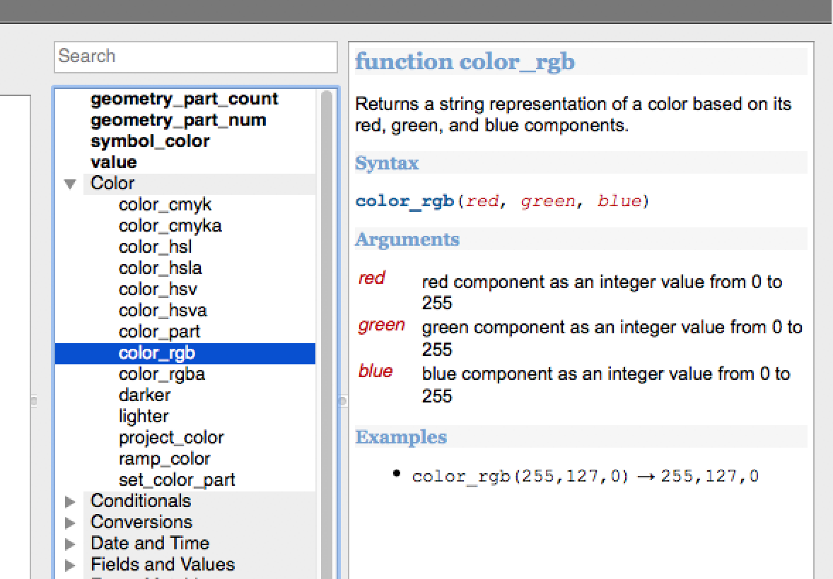
The rgb_color function takes an RGB color code and returns a color. We can specify a number from 0 to 255 for the red, green, and blue components – so rgb_color(255, 0, 0) is bright red, for example. So, in the simplest case, we could color our map this way:
CASE
  WHEN "r_clinton_two_party_margin" > 0
    THEN color_rgb(0, 0, 255)
  ELSE
    color_rgb(255, 0, 0)
END
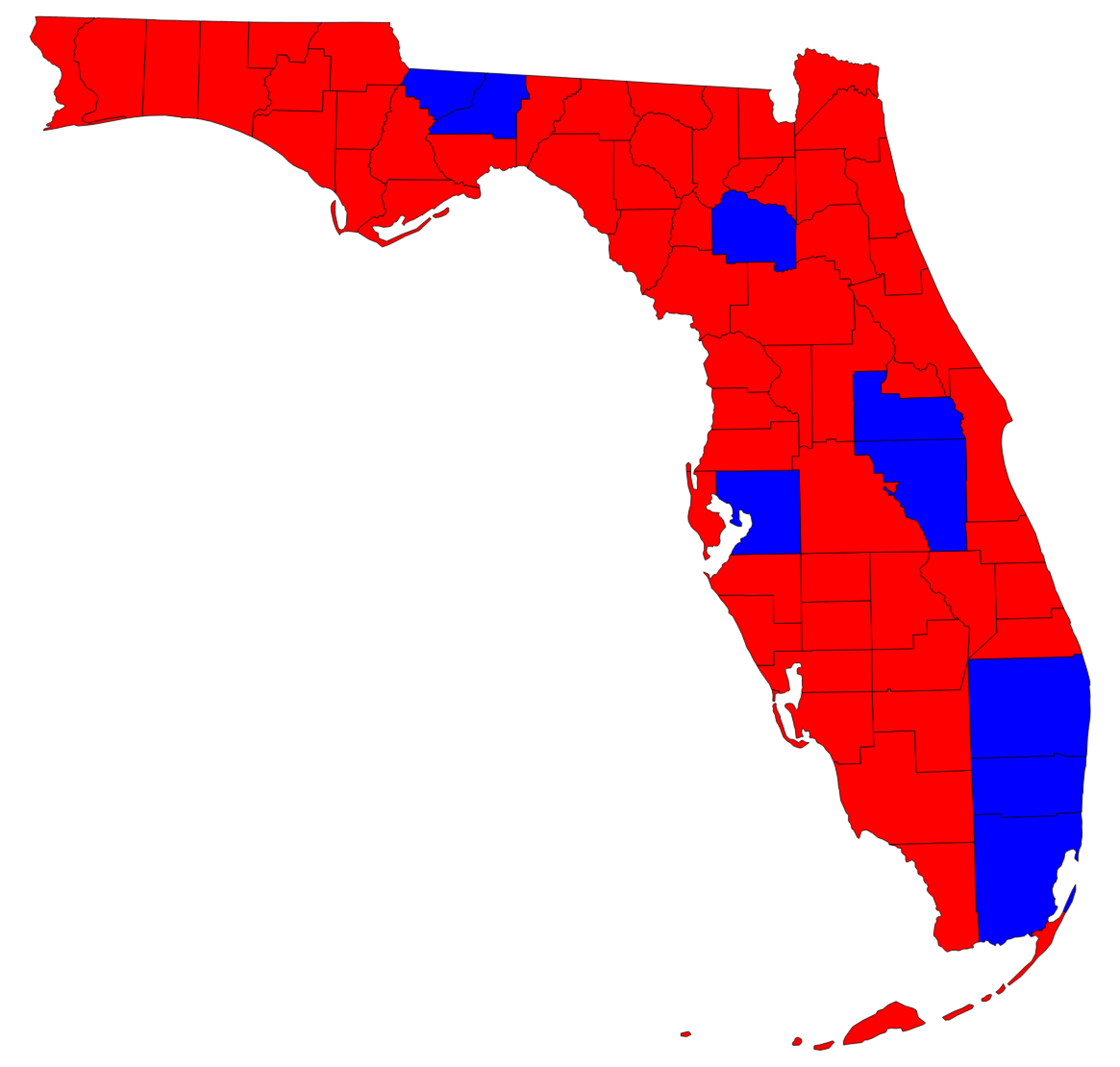
Now each county is colored according to the winning candidate:
However, we want to scale the color depending on the margin. We can do this by using the color ramps included in QGIS. These are derived from ColorBrewer, an online resource for choosing map color schemes.
QGIS has a built-in ramp_color function that takes two arguments: the name of the ramp, and a number between 0 and 1, which represents a position on the ramp. ramp_color('RdBu', 0) returns the color at the beginning of the red/blue ramp, which is deep red. ramp_color('RdBu', 1) is deep blue, ramp_color('RdBu', 0.5) is white (actually a very light gray), and so on.
The "r_clinton_two_party_margin" variable ranges from -1 to 1, not from 0 to 1. Thus, we can’t plug it directly into the ramp_color function. Fortunately, QGIS has another built-in function called scale_linear, which you can find under the Math heading, and which will allow us to convert the margin of victory into a number between 0 and 1.
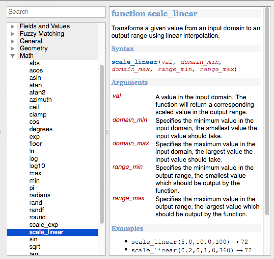
This function takes five arguments. The first is the number to be scaled. The second and third represent the maximum and minimum possible values for that number, and the fourth and fifth represent the maximum and minimum values for the output number. The following expression will take values between -1 and 1 and map them to numbers between 0 and 1:
scale_linear("r_clinton_two_party_margin", -1, 1, 0, 1)
However, there are no counties where Clinton or Trump won 100% of the vote. The largest margin for either candidate in Florida was in Holmes County, where Trump won the two-party vote by 79.5 points, which our table represents as -0.795. We want to use the entire color range, so we’ll scale the margin like this:
scale_linear("r_clinton_two_party_margin", -0.8, 0.8, 0, 1)
Remember that zero must be at the center of the input range. Clinton didn’t win any Florida county by more than 40 points, but if we used -0.8 and 0.4 rather than -0.8 and 0.8, the center of the color ramp would correspond to -0.2 (Trump +20) rather than 0, and some counties would be the wrong color.
Another helpful thing to know is that the second and third arguments must be in order from smallest to largest. In some cases you might want to map higher values to the beginning of the color ramp and lower ones to the end. In these cases, scale_linear("column_name", 1, -1, 0, 1) will not work. Instead, you can use scale_linear("column_name", -1, 1, 1, 0).
We can combine the ramp_color and scale_linear functions to convert the margin of victory to a position on the color ramp:
ramp_color('RdBu', scale_linear("r_clinton_two_party_margin", -0.8, 0.8, 0, 1))
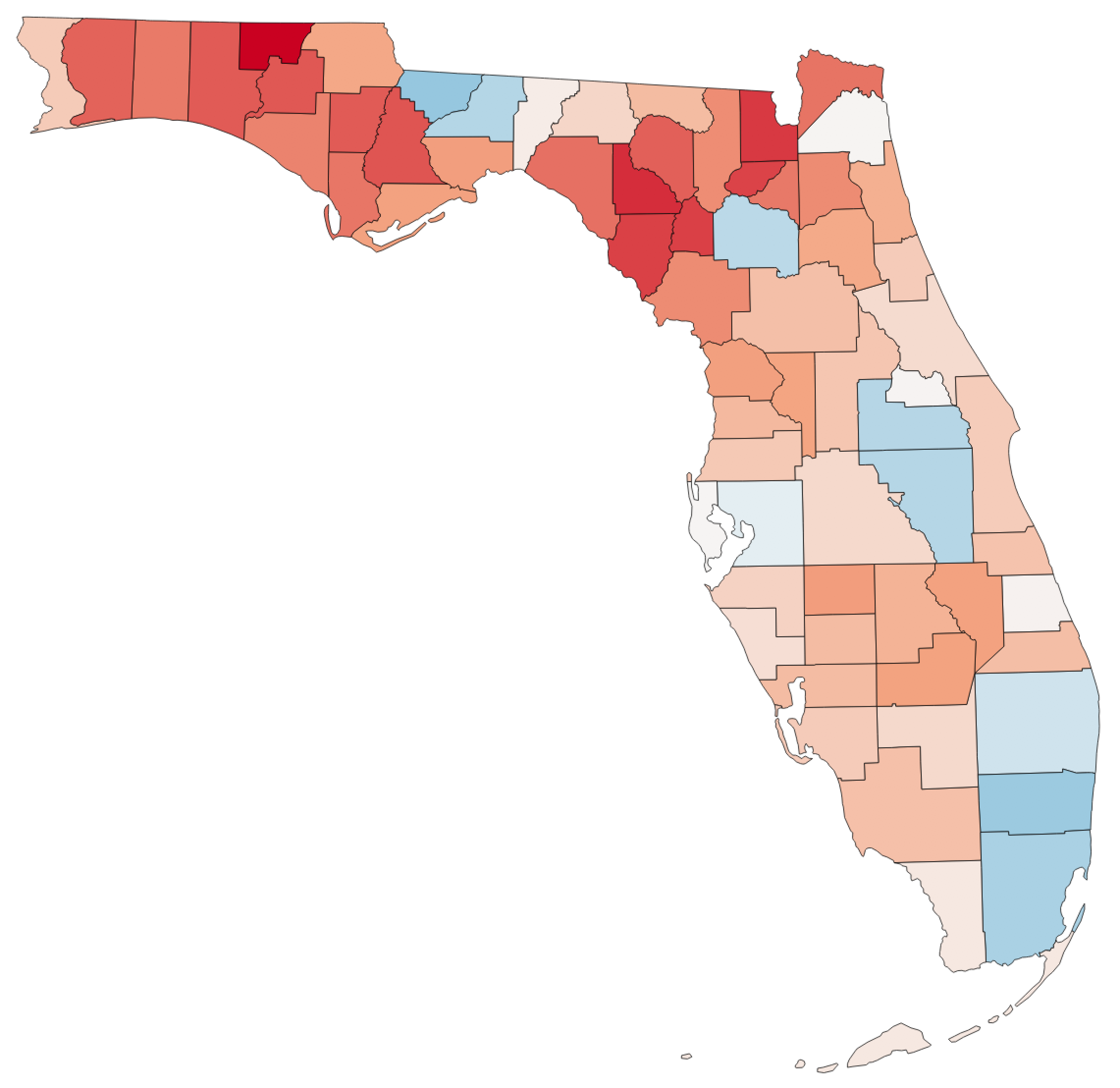
I also like to add a rule that colors counties gray when no data is available. In this case there are no such counties, but for the sake of consistency I’ll do it here as well. Our final expression for the fill color is as follows:
CASE
  WHEN "r_clinton_two_party_margin" IS NULL
    THEN color_rgb(127, 127, 127)
  ELSE
    ramp_color('RdBu', scale_linear("r_clinton_two_party_margin", -0.8, 0.8, 0, 1))
END
And now we finally have the map we wanted to make:
7. Exporting the map
In order to publish or distribute your map, you’ll need to export it in a usable format. The simplest way to do this is to save it as an image file using Project > Save as Image… However, this may create a poor-quality image, and it doesn’t provide any way to add a title or legend to your map.
QGIS has a built-in tool for creating maps called the Print Composer. The official QGIS tutorials explain this fairly well, so I won’t cover it exhaustively here. However, the built-in QGIS legends won’t work for a custom style like our color ramp, so you’ll have to create your own scale. You can do this in the Print Composer by selecting Layout > Add Shape > Add Rectange, then styling the rectangle with a gradient fill:
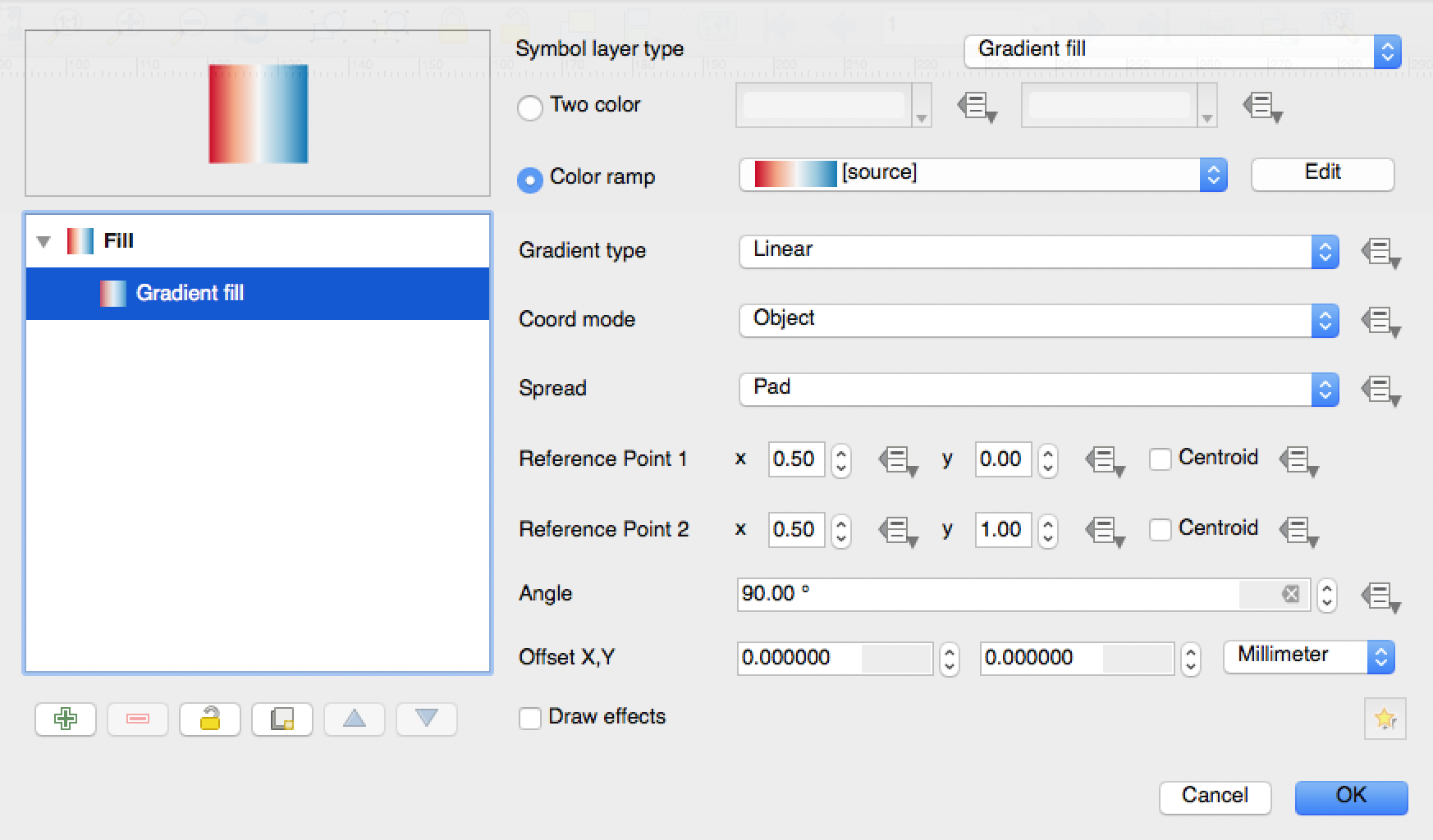
You can then add labels to each end of the scale (in this case, “R+80” and “D+80”) by using Layout > Add Label.